One source of truth for every screen, every designer, every developer.
Component libraries and design tokens that scale without inconsistency.
A design system is an investment that pays compound returns. Every hour spent building a coherent component library saves multiple hours in every future design and development cycle. The cost is front-loaded; the benefit is ongoing.
Nova Studio builds design systems that are genuinely useful in practice rather than impressive in presentation. The key question we ask before building any component is: will a developer be able to use this without asking a designer for clarification? If not, the specification is not detailed enough.
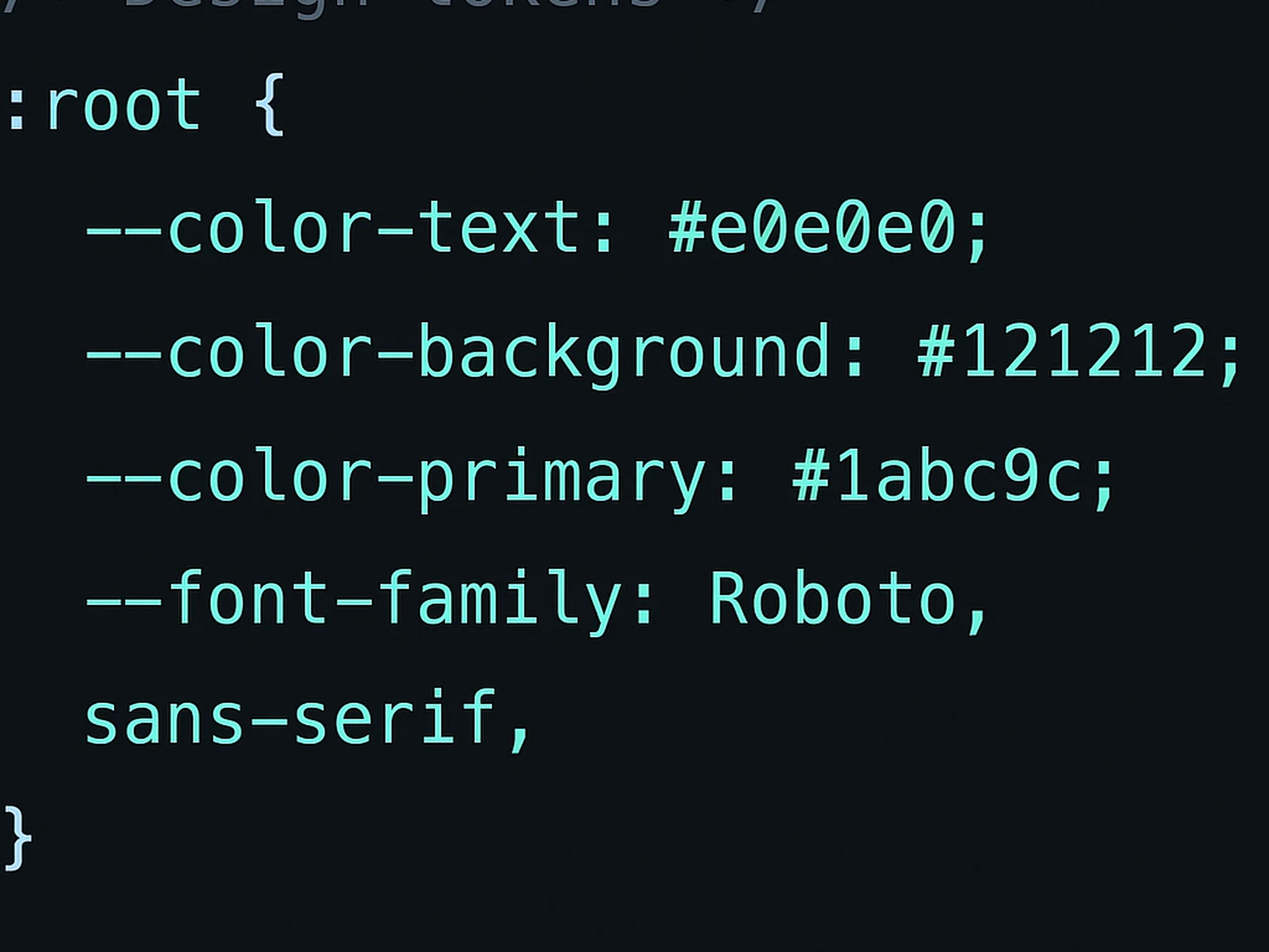
Design tokens form the foundation: colour, typography, spacing, and elevation values defined once and referenced everywhere. When a brand colour needs to change, it changes in one place. When the spacing scale needs adjustment, it adjusts across the entire product. Tokens that are designed correctly make this kind of change trivially easy; tokens that are not make it almost impossible.
Component documentation covers: the visual specification, interactive states (default, hover, active, disabled, error, loading), usage guidelines (when to use this component and when not to), and accessibility requirements for implementation. Components without this context are frequently misused.
For teams that need to move between design and code, we produce design token exports in CSS custom properties and/or JSON for direct import into design token management tools.
In practice
Common questions

This service is included in our Standard and Studio packages, and available as a focused sprint.
Start with
Design Systems.
Choose a package or build your own. We reply within one business day.